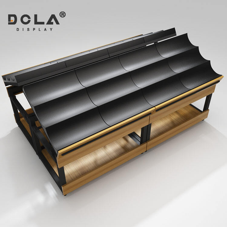
Produce Trays as Silent Salesmen at the Point of Purchase
The modern produce tray has become something of a silent salesperson on supermarket shelves, quietly boosting what customers see and ultimately what they buy. These trays showcase fruits and veggies in neat, colorful arrangements that make everything look fresher and easier to find. According to recent data from Food Retail Insights (2023), stores that switch to trays with slanted sides and just the right depth see about a 22% jump in customer interaction with their produce sections. The reason? These specially designed trays cut down on those pesky shadowy areas where items get hidden when stacked too high.
Evolution From Functional Packaging to Marketing-Driven Design
The shift from utilitarian containers to brand-centric tray designs reflects changing consumer expectations. Where early trays prioritized basic protection, contemporary versions incorporate:
- Color blocking that mirrors seasonal produce trends
- Brand logos positioned for vertical visibility on store shelves
- Matte finishes that reduce glare under supermarket lighting
This transformation aligns with studies showing 68% of shoppers associate cohesive packaging design with perceived product quality.
Balancing Durability, Sustainability, and Visual Appeal in Tray Construction
Today's manufacturers are hitting all three marks at once when it comes to durability, environmental standards, and looks thanks to new materials science. Take those molded fiber trays coated to resist water damage they hold up great for delicate veggies like lettuce yet will still break down in a home compost pile within weeks. Some companies have even developed clear plastic alternatives made from hybrid polypropylene that let shoppers see products from every angle without giving up on recycling options. About 59 percent of customers want green packaging solutions but won't settle for something that doesn't work properly, so these kinds of improvements make sense for both businesses and their environmentally conscious buyers.
Leveraging Color Psychology to Influence Freshness Perception and Purchase Decisions
How Color Impacts Consumer Perception of Ripeness and Freshness
The colors of produce trays actually tell customers something about quality pretty quickly too. According to some research from Food Marketing Institute back in 2023, around two thirds of shoppers form opinions about how fresh items are within just three seconds flat. Red trays make those strawberries look extra ripe and tomatoes seem juicier somehow. Green packaging? That makes lettuce and spinach appear crisper than they might otherwise. Retailers use this color trickery all the time to connect what fruits and veggies looked like when picked straight from the farm with how they sit on store shelves waiting to be bought.
Psychological Effects of Red, Yellow, and Green in Produce Packaging
- Red: Triggers appetite responses and urgency, ideal for berries and stone fruits
- Yellow: Creates optimism cues, increasing grab-and-go purchases of bananas and citrus
- Green: Signals natural integrity, boosting trust in herbs and broccoli
Overusing artificial neon tones can reduce perceived nutritional value by 42% compared to earth-toned trays (Packaging Digest 2022 study).
Aligning Tray Color With Natural Product Appearance for Authenticity
Matching tray undertones to produce's inherent colors reduces cognitive dissonance. Eggplant packaging with deep purple accents receives 23% more handling than plain black trays, while honeydew melons in muted green trays outsell white alternatives 3:1. This chromatic harmony reinforces the product's unprocessed narrative.
Avoiding Over-Colorization: Balancing Vibrancy With Consumer Trust
While bright trays increase visibility by 57%, excessive saturation triggers skepticism about quality masking. The optimal balance follows the 70/30 rule: 70% neutral background tones supporting 30% strategic color accents. Transparent window sizing should maintain 40% product visibility to validate color claims through actual produce quality.
Maximizing Product Visibility Through Smart Tray Design
Incorporating Clear Windows and 360-Degree Visibility for Unobstructed Viewing
These days, most fresh produce containers come with see-through sections so customers can actually see what's inside. According to research published in the 2023 Produce Visibility Study, when shoppers could look through clear panels on packaging rather than just guessing at what was inside, they were 27% more likely to buy the item. Stores have started experimenting with different window shapes and textured surfaces that cut down on reflections without making the container flimsy. This matters a lot for fragile goods such as strawberries or those fancy heirloom tomato varieties that bruise easily.
Optimizing Window Size to Balance Branding Space and Product Exposure
Getting tray designs right means paying close attention to how much window space there is compared to solid surfaces. Most industry standards point towards showing around 60 to 70 percent of what's inside as being just right for making products look good without losing valuable brand visibility areas. According to some food retail experts, stores saw about a third less damage from customers messing with stuff when trays had windows cut out to show off the best parts of fruits and veggies but still kept delicate things safe from getting crushed. The Food Standards Agency did some research on this back in 2022.
Case Study: Stoplight Peppers — A Model for Effective Colorful Prepackaged Trays
The 2024 "Tri-Color Pepper Pilot" demonstrated how smart tray design boosted sales:
| Metric | Before Transparent Trays | After Implementation |
|---|---|---|
| Shelf Engagement Time | 2.1 seconds | 5.8 seconds |
| Spontaneous Purchases | 12% | 29% |
| Perceived Freshness | 6.4/10 | 8.9/10 |
By combining full-front windows with color-coordinated tray bases, this approach reduced in-store handling by 41% while maintaining 99.2% package integrity through distribution.
Using Colorful Produce Trays for Brand Differentiation in Competitive Aisles
Standing out with vibrant, eye-catching tray colors and designs
When stores get busy, fruit and veggie displays that pop with bright colors stand out way better than boring packages. According to Packaging Digest from last year, these colorful trays catch eyes about 38 percent more often than plain ones. Think about those vibrant oranges set against dark grays they really grab attention and make people stop walking right there in the aisle. But watch out for going overboard on colors because some research found that too many different shades actually makes it harder for customers to remember brands, cutting recall down around 22%. Smart retailers have noticed something interesting though most successful displays stick to just two or three striking colors while keeping branding simple and clean. This approach seems to work best for getting shoppers to notice what's on offer without overwhelming them visually.
How consistent packaging strengthens brand recognition in fresh produce
According to a recent survey from 2023, around two thirds of shoppers can spot their favorite produce brand within three seconds if the tray colors line up with what they expect from that brand. When companies keep these visual cues consistent across all their products, customers tend to come back more often too - about 19% increase in repeat business actually (Tighe & Co found this). Take seasonal goods for instance. Smart brands stick to core colors but play around with accents depending on the time of year. Think pumpkin shaped packaging with green bases and golden edges during fall months. This keeps things familiar yet fresh looking at the same time. The real magic happens when retailers balance immediate attention grabbing visuals with building something lasting for their brand over time.
Innovative Materials That Boost Visual Clarity and Sustainability
Transparent and Anti-Fog Films for Consistently Clear Product Visibility
Advanced polyethylene terephthalate (PET) blends with silica-based coatings prevent condensation buildup, achieving 92% light transmission rates. A 2023 material science review found nano-coated films extend produce display life by 34% through optimized oxygen permeability. Retailers report 18% fewer customer handling incidents due to improved visual access compared to frosted plastic alternatives.
Eco-Friendly Materials That Preserve Color Vibrancy and Shelf Appeal
Bioplastics derived from sugarcane fibers are finally on par with traditional plastic when it comes to clarity, which is pretty impressive considering they cut down carbon emissions by about 41% according to recent packaging studies from 2024. Algae based materials keep their vibrant colors thanks to natural protection against UV rays, making products look great on store shelves without needing those chemical additives we all try to avoid these days. And for recycled PET options reinforced with minerals, manufacturers can reach nearly 90% post consumer material usage while still keeping colors consistent enough to satisfy strict European Union standards for packaging materials.
FAQ
What role do produce trays play in retail merchandising?
Produce trays act as silent salesmen in retail, boosting visibility and appeal of fruits and vegetables through strategic design and color usage.
Why is the color of produce trays important?
The color plays a crucial role in consumer perception, influencing perceived freshness, quality, and purchase decisions based on psychological responses to different hues.
How does tray design enhance product visibility?
Modern trays often feature clear windows and 360-degree visibility to allow customers to view products completely, thereby increasing likelihood of purchase.
Are there eco-friendly options for produce trays?
Yes, manufacturers are creating trays from biodegradable materials like molded fiber and algae-based bioplastics that reduce environmental impact while maintaining durability and visual appeal.
Table of Contents
- Produce Trays as Silent Salesmen at the Point of Purchase
- Evolution From Functional Packaging to Marketing-Driven Design
- Balancing Durability, Sustainability, and Visual Appeal in Tray Construction
- Leveraging Color Psychology to Influence Freshness Perception and Purchase Decisions
- Maximizing Product Visibility Through Smart Tray Design
- Incorporating Clear Windows and 360-Degree Visibility for Unobstructed Viewing
- Optimizing Window Size to Balance Branding Space and Product Exposure
- Case Study: Stoplight Peppers — A Model for Effective Colorful Prepackaged Trays
- Using Colorful Produce Trays for Brand Differentiation in Competitive Aisles
- Innovative Materials That Boost Visual Clarity and Sustainability
- FAQ